The Man in the Flip-Top Mask
The Man in the Flip-Top Mask
or: Take the Cash, Let the Credit Go
Close my eyes... nuthin' up my sleeve... presto change-o... Tales of Suspense #48.
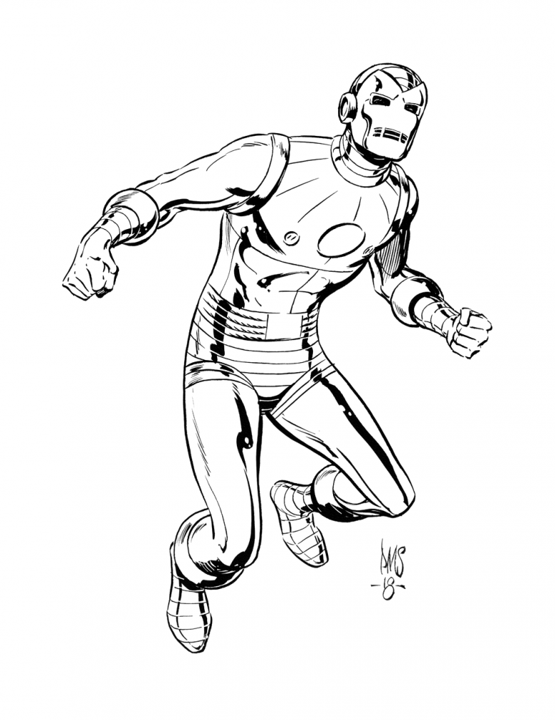
Presto Change-o is right. We see a cosmic shift in Iron Man's history in this issue with, in what becomes a long line of armor revisions, the first appearance of the red and gold suit. Gone is the bullet head look in favor of an actual man of iron.
In my informal survey, this is the most beloved iteration in the armors evolution. What survey... and define informal? Anytime the discussion turns to this armor, you always get the same response followed by the same question. "I LOVE the flip-top mask armor! Why'd they change it?" The answer is pretty simple: time marches on, artists come and go all making their own tweaks, alumni passing through ask innocent questions about Tony's nose...
The bigger question to me is who came up with this one? Ditko man that I am, it would be easy to lay this at Steve's feet. It's obvious Steve drew the story. Even for those that can't spot Ditko's style a mile away, his name's right there in the credit box. I just don't think it's that simple.
Correlation and causation are different animals. The light going out at the same moment I sneeze does not connect my respiratory system to the circuit breaker. It was simply happenstance. It's not even a coincidence until it happens again.
A common practice du jour was to produce the cover first so the interior artist might use the cover as a model. For examples look to the first appearances of both Iron Man and Daredevil.
Ditko and Kirby were as stylistically opposite as you could get. Neither fared well drawing the other's characters. Ditko's Thing, Captain America, Thor never looked right and worse, they looked dull. Kirby couldn't draw Spider-Man to save his life. The red and gold lacks the quirkiness and asymmetricallity of a Ditko design yet fits perfectly within Kirby's visual oeuvre.
For what it's worth (which is 12¢ short of nuthin') I'm going with Kirby on this one.
Happy Trails,
Smitty
5 Comments so far


